

Fundamentals of UX Design
Great digital experiences depend on understanding human needs and the fundamentals of UX design, not just on trendy designs or advanced technology. Timeless principles guide the way we create these experiences.
Fundamentals of UX Designs are now essential for businesses. Companies that invest in UX see 75% higher conversion rates and an 83% boost in customer retention. However, many designers still struggle with the basics. These are the fundamental principles that make good design transform into great experiences.
After looking at thousands of successful digital products and talking with industry leaders, we found seven key principles that every UX designer should have in their toolkit.
-
- User-Centered Design
-
- Consistency
-
- Hierarchy & Visual Clarity
-
- Usability (Ease of Use)
-
- Accessibility (Inclusive Design)
-
- Feedback & Affordance
-
- Minimalism & Simplicity
User-Centered Design
Focus on the needs, goals, and behaviors of real users. Conduct user research (surveys, interviews, usability testing) to inform design decisions. Avoid assumptions—design based on data, not personal preferences.
Key Principles of User-Centered Design
Empathy and User Understanding: Deeply understanding who the users are, their motivations, goals, frustrations, and the context in which they use the product
Early and Continuous User Involvement: Users are involved throughout the design process—from ideation and prototyping to testing and refinement—ensuring their feedback shapes the solution.
Iterative Design and Testing: The process is cyclical, with ongoing user feedback leading to continuous improvement and refinement of the product
Focus on Usability and Accessibility: Products are designed to be easy to use and accessible to a wide range of users, including those with disabilities
Balancing User Needs with Business Goals: While user needs are central, UCD also considers business objectives and technical constraints to create viable, valuable products
User-Centered Design Process
- Understand the User and Context: Conduct research (interviews, surveys, observations) to gather insights about user needs, behaviors, and environments
- Specify Requirements: Clearly define the critical functions of the product that are necessary to address the identified needs, driven by compelling research findings.
- Design Solutions: Create prototypes or wireframes that address the identified requirements
- Evaluate and Iterate: Test the prototypes with real users, gather feedback, and refine the design in iterative cycles until the product meets user expectations.
Examples of User-Centered Design
Airbnb: Airbnb’s platform is designed with user-centered principles, focusing on easy navigation and personalization so users can quickly find accommodations that fit their needs.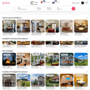
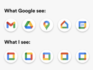
Consistency is Fundamentals of UX Design
Consistent UX design is the secret sauce for a smooth and enjoyable user experience! By keeping design elements, interactions, and behaviors uniform, we create an intuitive environment that guides users effortlessly. This not only enhances usability but also builds trust and familiarity, making every interaction memorable and enjoyable.
Key Aspects
- Maintain uniformity in design elements (buttons, icons, typography, colors) across the product.
- Follow platform conventions (e.g., iOS Human Interface Guidelines, Material Design).
- Reduces cognitive load and improves learnability.
Hierarchy & Visual Clarity Fundamentals of UX Design
Visual hierarchy is incredibly important in helping you navigate content effectively. Designers understand that by arranging elements according to their significance, they can make your experience smoother and more intuitive. They thoughtfully use techniques like size, color, contrast, spacing, and strategic placement to grab your attention and guide you where you need to go. By establishing a clear visual pathway, these designers strive to ensure that the information you need most stands out, making your experience more enjoyable and efficient.
Key Techniques:
- Size & Scale – Larger elements grab attention first.
- Color & Contrast – Bold or bright colors highlight key actions.
- Typography – Headers stand out with heavier fonts.
- Whitespace– Creates focus by reducing clutter.
- Alignment & Proximity – Groups related items logically.

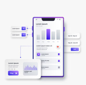
Usability (Ease of Use)
Usability in UX design is all about making sure that users can easily and effectively reach their goals when interacting with a product, system, or interface. We understand that a positive experience is essential, and that’s why focusing on how easy and satisfying each interaction is can truly make a difference.
We measure usability through five key attributes, keeping your needs and preferences at the forefront of our design process. Your experience matters, and we’re committed to creating solutions that work for you.
- Consistency: Keep patterns predictable
- Visibility: Show users what’s possible
- Feedback: Let users know when actions happen
- Affordance: Make controls look interactive
- Simplicity: Remove unnecessary complexity
Accessibility (Inclusive Design)
Ensure the product is fully accessible to individuals with disabilities by adhering to WCAG (Web Content Accessibility Guidelines) compliance standards. This includes implementing sufficient color contrast ratios to enhance readability for users with visual impairments, incorporating descriptive alt text for all images to provide context to users who rely on screen readers, and supporting keyboard navigation to ensure that all interactive elements can be accessed without a mouse. Additionally, use scalable fonts that can easily be adjusted in size without loss of content or functionality.
It’s essential to conduct thorough testing with various screen readers and assistive technologies to identify and rectify any accessibility barriers, ensuring an inclusive user experience for everyone.
Feedback & Affordance
Make interactive elements obvious (e.g., buttons should look clickable). Provide immediate feedback (e.g., animations, error messages, success notifications). Prevent user errors with helpful constraints and validation.
- Show loading when waiting
- Confirm when something is done
- Explain errors clearly
- Guide users through steps
Minimalism & Simplicity
Minimalism and simplicity empower UX designers to create interfaces that users navigate effortlessly and complete tasks efficiently.
Key Principles
- Eliminate the Unnecessary: Remove decorative elements that distract users from their goals.
- Create Hierarchy with Whitespace: Use generous whitespace to direct user’s attention and give their eyes room to rest.
- Emphasise Typography: Let clean, readable fonts carry your message when you remove competing visual elements. Establish a clear information hierarchy through strategic font sizing, weight, and spacing rather than relying on colors or decorations.
Conclusion
UX design is super important because it’s all about how people like using a thing. It’s not just about making stuff look pretty but also about how well it works. If you wish to create user-friendly elements, maintain them as understandable, minimal, and consistent in all aspects. Most importantly, think about what your users actually need. When people have a good time using your stuff, they can get things done without any trouble. Plus, they learn to trust you, and they’ll keep coming back for more! So, whether it’s a website, an app, or anything digital, keeping these UX ideas in mind will help make things way better.
