
What is UX Design Psychology
UX design psychology means understanding how people think, feel, and behave and using that knowledge to design websites or apps that feel natural and easy to use. When designers think about human behavior, they can create better experiences. The goal is to make users feel comfortable, confident, and happy while using your product.
Why is Psychology Important in UX Design
Good design is not just about looks. It’s about how it works. If you know how people think and behave, you can guide them better through your website or app. Understanding psychology helps remove confusion and builds trust.
For example, if people usually scan pages from left to right, you might want to place your most important content on the left side. If users feel safe when they see familiar patterns, it’s better to follow design standards rather than trying something too different.
Simple UX Design Psychology
Hick’s Law
The more choices you give someone, the longer it takes them to decide. Simple rule: More options = More thinking time = Slower decisions.
Real-Life Examples
Good: McDonald’s menu boards show meal categories (burgers, chicken, drinks) instead of listing every single item. The TV remote has separate buttons for power, volume, and channels, not 100 tiny buttons
Bad: A restaurant menu with 200 different dishes will take you forever to order. A website with 20 different signup buttons, users get confused and leave
Why This Happens
- Look at all the options
- Compare them
- Think about each one
- Finally pick one
How Designers Use This
- Streaming apps: Show “Continue Watching” and “Top Picks” instead of showing all movies at once
- Shopping sites: Use filters to narrow down products
- Mobile apps: Put only the most important buttons on the main screen.
Fitts’ Law
When you click something with your mouse or tap something with your finger, two things matter most how big the target is and how far you need to move. The rule works like this: You can easily click big things that sit close to you. You struggle to click small things that sit far away. Designers use this law to create better websites, apps, and devices. Designers apply this law when deciding where to place buttons and how large to make them. Paul Fitts discovered this rule. He studied how people point at and click on things.
Example: ATM machines the “YES” and “NO” buttons are huge because people need to press them quickly and accurately.
Cognitive Load Theory in UX Design Psychology
The human brain works like a computer with limited memory. Overloading your brain with too much information causes it to slow down.
Working Principle: Think of your brain as having a small basket. You can only fit so many things in the basket before it overflows. When websites or apps throw too much information at you, your mental basket overflows, and you feel confused.
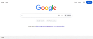
Real examples: Google keeps their homepage simple with just one search box. This helps your brain focus on one task searching. Amazon shows you product categories instead of displaying thousands of products at once. This approach prevents your brain from getting overwhelmed.
Why designers care: Smart designers remove unnecessary elements from their designs. They break complex tasks into smaller steps. They use white space to give your brain room to breathe. They organize information in logical groups so you can process it easily.
The three types of mental load:
1. Intrinsic load: The actual task you want to complete
2. Extraneous load: Confusing design elements that distract you
3. Germane load: Your brain is learning new patterns
The Visual Hierarchy of UX Design Psychology
Big Things Grab Your Attention: Have you ever asked yourself why your eyes are drawn to some parts of a web page more than others. It’s usually the big stuff that gets your attention right away! That’s why titles and main pictures are bigger they’re made to grab your eye and help you quickly go through what’s there. It’s cool how that works.
Easy-to-Read Text: Dark text on a light background (or the other way around) is way easier to read. When things have high contrast, you can read without straining your eyes.
Where Components Are Placed Matters: Stuff at the top or in the middle of a page is usually what you see first. That’s why logos and menus are often there easy to spot.
White space allows things to stand out: when something has white space surrounding it, it becomes prominent. This neat trick makes it easier to scan and see what you’re looking for.
How Designers Guide Your Eyes: Every part of a design is carefully placed to make you see what they want you to see. This makes using the website much better.
Buttons That Shine: Bright buttons are difficult to miss! They usually have space around them so you know where to click, making things simple.
Images That Matter Are Easy to See: Important images are usually bigger or in the center, showing they’re the main focus, this gets you more content.
The Psychology of Color
The psychology of colors triggers emotions and associations in people’s minds. Colors do more than just make things look good. In design, colors chat with people even before they read anything. Color is a powerful tool for influencing how people feel about a product or app because our minds respond to colors very quickly.
Colors trigger feelings. Red can make someone feel like something is urgent, risky, or needs care. That’s why you see red on delete buttons. It’s like the color shouts, “Careful!” It just grabs your eye and makes you stop and think.
Now, the green light suggests it is secure to continue, and you may take the next step. It reminds us of nature and moving forward. Therefore, designers have placed it on submit or next buttons. It gives you a sense of accomplishment for doing that. These color associations come from things we observe in everyday life. Stop lights are red, and go lights are green. Emergency signs use red to grab you right away. Banks often use blue because it feels safe and makes you calm.
The Psychology Behind Pattern Recognition
People feel better when things are easy to recognize. This is why we put layouts, icons, and patterns you already know into app and website designs. When you spot a pattern, you quickly get what’s up without having to think too hard. Imagine knowing exactly how to open a door just by looking at its handle.
Our brains are all about doing things the quick way. When something looks familiar, we don’t pause to work it out. We save time and energy. It saves users from having to learn a new app or website every time, which is good for design. People tend to trust things they already know. Familiar designs feel safe and comfy. Therefore, people will click a button if it appears to be a button. If the shopping cart icon is where it should be, they will know where to go pay.
Everyday Examples in UX Design Psychology
Shopping Carts: They almost always look like a tiny trolley.
Search: Usually, it’s a magnifying glass icon.
Menu: That little hamburger icon (three lines) is super common.
E-commerce Patterns
Most stores online do things the same way this pattern works. Shoppers can browse, filter, and buy without confusion.
- Products show up in rows and columns.
- You can usually filter things on the left side.
- The shopping cart icon is at the top right.
Mobile App Design
Bottom Navigation: Easy to hit with your thumb.
Swiping: Swipe to delete or save.
Pull to Refresh: Pull down, and things update. Everyone knows this one.
Final Tips
Getting psychology in user experience design lets you make stuff that feels easy and right for people to use. When you get how people think and act, you can design pages that lead them along without hassle, keep them from getting annoyed, and get them to trust you. Stuff like using layouts people know, not making them think too hard, or picking the right colors all makes a difference. Good UX is all about feeling what the user feels. And psychology is what lets you do that.

Leave a Reply